What Actually Drives National Happiness — And One Factor That Barely Matters
The World Happiness Report has been running since 2005. By 2025, it covers 168 countries and 14 years of data. Most coverage focuses on the annual ranking — Finland is first, Afghanistan is last. But there is a more interesting question buried in the data: which factors actually explain why some countries score 7+ while others score below 3?
The 2019 report added a factor decomposition: for each country-year, it breaks the happiness score into six measurable contributions — GDP per capita, social support, healthy life expectancy, freedom, generosity, and corruption perception. This makes it possible to run an actual driver analysis, not just observe rankings.
Finding 1: The World Has Gotten Measurably Happier
The global average happiness score rose from 5.39 in 2011 to 5.65 in 2025 — a gain of +0.26 points over 14 years. The trend is consistent and statistically significant (Spearman r=0.87, p<0.001).
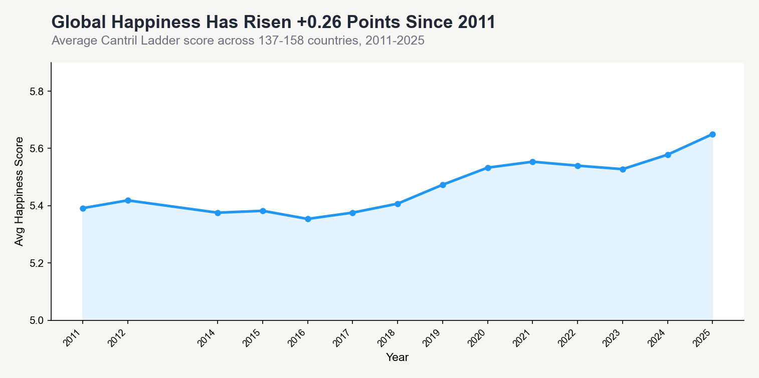
That is a small number in absolute terms. On a 0–10 scale, 0.26 points barely registers. But it held across COVID (2020 saw a slight rise, not a crash), geopolitical shocks, and economic cycles. Human life evaluation is more stable than moment-to-moment news would suggest.
The previous analysis on this dataset used a balanced panel of 129 countries to control for sample composition changes. The finding holds in both the full sample and the balanced subset.
Finding 2: Social Support and GDP Are the Strongest Drivers
Using the 2019–2025 subset (1,019 country-years, the only period with full factor decomposition), Spearman correlations reveal which factors move together with high national happiness scores.
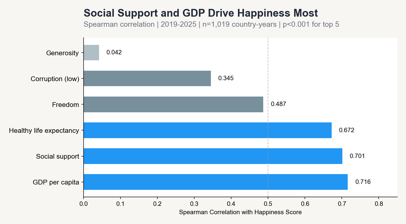
| Factor | Spearman r | Significance |
|---|---|---|
| GDP per capita | 0.716 | p<0.001 |
| Social support | 0.701 | p<0.001 |
| Healthy life expectancy | 0.672 | p<0.001 |
| Freedom | 0.487 | p<0.001 |
| Corruption (low) | 0.345 | p<0.001 |
| Generosity | 0.042 | p=0.18 (not significant) |
Three factors cluster tightly at the top and are difficult to separate — wealthy countries tend to have better healthcare and stronger social safety nets simultaneously. GDP has the highest correlation in this sample, but social support is close.
The bottom of the table is the more interesting finding.
Finding 3: Generosity Barely Matters at the National Level
The generosity correlation with happiness is r=0.042 and not statistically significant (p=0.18). Countries where people report donating more to charity are not systematically happier at the national scale.
This runs counter to a large body of individual-level research suggesting that giving makes people happier. The likely explanation is a measurement problem: the WHR generosity metric captures formal charitable donations, which are concentrated in wealthier countries with established nonprofit infrastructure. It may not capture the informal mutual aid, family networks, and community support structures that are more common in lower-income countries — and that may matter much more for wellbeing.
At the national level, generosity as measured by this dataset is close to noise. Social support — having someone to count on in a crisis — is the structural variable that matters.
Finding 4: The Biggest Movers Since 2011
Among the 141 countries tracked in both 2011 and 2025, the range of change is striking.
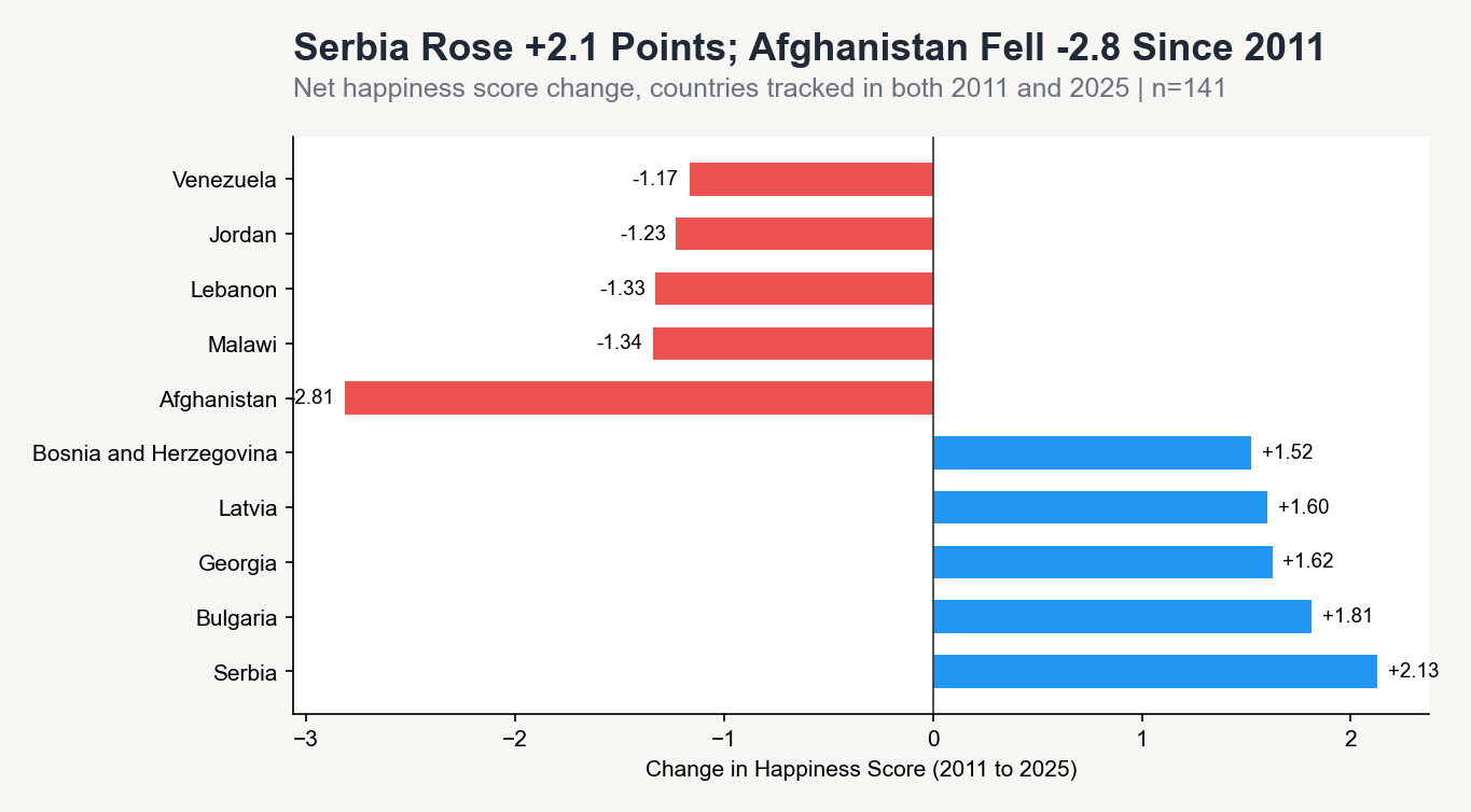
Serbia improved the most (+2.13 points), driven by economic development and EU integration progress. Bulgaria, Georgia, Latvia, and Bosnia and Herzegovina round out the top five — all post-communist countries with similar trajectories.
Afghanistan declined the most (-2.81 points). The score had been falling gradually since 2011, but the 2021 political transition accelerated the drop to 1.45 by 2025 — the lowest score in the world, by a significant margin.
Most countries moved less than 0.5 points. The outliers in either direction are almost always explained by structural political or economic events, not shifts in culture or values.
Finding 5: The Happiness Gap Is Widening
While the global average rises, the gap between the happiest and least happy countries is growing.
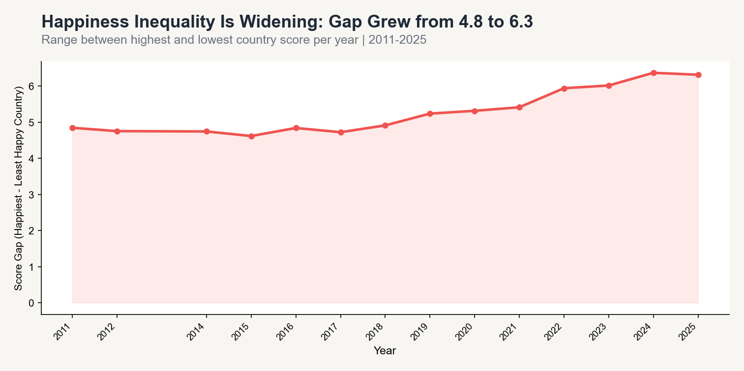
The range between the top and bottom country score grew from 4.8 points in 2011 to 6.3 points in 2025 — a 31% increase. The rising average is real. But the countries that most need improvement are not keeping pace with those already doing well.
This is the part the annual ranking headlines do not show.
Three Takeaways
1. Social support is more important than GDP. The correlations are similar (0.70 vs 0.72), but social support is something governments can invest in directly — healthcare access, caregiving infrastructure, community programs — without waiting for GDP growth.
2. Generosity is not a happiness lever at national scale. The near-zero correlation is a genuine finding, not noise. Investing in social support structures matters far more than promoting charitable giving.
3. The average is misleading. Global happiness is rising. But the gap between top and bottom is also rising. Any policy framed around improving global averages is incomplete without focus on the countries at the bottom of the distribution.
Methodology notes:
- 2,116 rows covering 168 countries, 2011–2025 (2013 missing from source data).
- Factor decomposition available from 2019 onward only. Driver analysis uses 1,019 country-years.
- Spearman correlation used — Cantril Ladder scores are bounded (0–10) and factor distributions are right-skewed. Results consistent with Pearson for top drivers.
- Minor source anomaly: Gambia and Sri Lanka share rank 120 in 2018 despite different scores. Does not affect any headline finding.
- All factor contributions verified to sum to happiness score within 0.003 tolerance.
Code & Data: View the analysis scripts here