What 14 Years of Happiness Data Really Shows
In brief
A consistent country panel separates long-term progress from changing rankings and shows where the score gap widened.
Executive summary
Decision: where should a development or policy team focus attention? Finding: the average country score rose, but the gap between the highest- and lowest-scoring countries widened. Evidence: a descriptive comparison of the same 129 countries across 14 measured years. Recommendation: track both average progress and the bottom of the distribution; do not treat country-level correlations as policy effects.
Problem - yearly rankings do not show a consistent trend
Annual rankings can change because countries enter or leave the comparison. A policy team needs to know whether the same countries improved, whether gaps narrowed, and which factors moved with life evaluations.
The question is: how did national life evaluations change from 2011 to 2025, which countries moved most, and which reported factors were most closely associated with the scores?
I selected the country panel, checked the trend and associations, and framed the decision. I did not evaluate or implement a national policy intervention.
Hypotheses - what could explain the pattern?
- The average may look different when the country set changes. A fixed panel can separate within-panel movement from changes in annual coverage.
- A rising average may hide a wider gap. Compare the highest and lowest scores as well as the average.
- Income, social support, and health may move with reported life evaluation. These associations can guide questions, but they cannot identify the effect of a policy.
Analysis - what did the same-country panel show?
The World Happiness Report 2026 Figure 2.1 workbook covers 168 countries in 14 measured years from 2011 through 2025; 2013 is absent. I compared the 129 countries with data in every measured year. Scores are self-reported three-year-average life evaluations on a 0 to 10 scale. Country averages are unweighted, not population-weighted.
I selected the balanced panel, checked the country trends and factor associations, and framed the follow-up questions. I did not evaluate or implement a national policy intervention.
The average rose, including after the 2021 to 2022 dip
The balanced-panel average rose from 5.47 in 2011 to 5.74 in 2025, a 0.26 point increase. It dipped in 2021 and 2022, then recovered to a panel high in 2025. This does not mean every country improved.
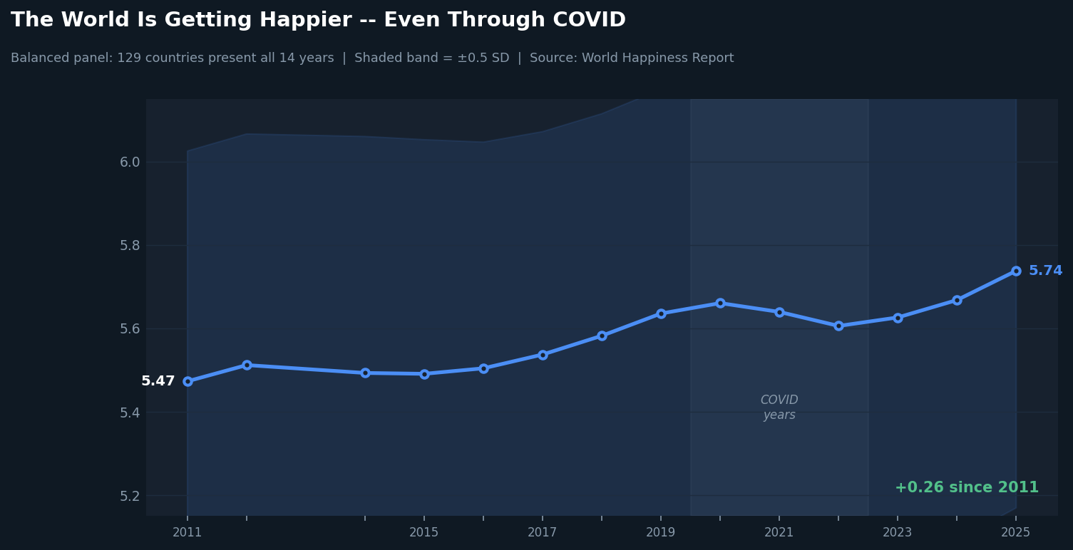 Scroll horizontally to inspect chart labels.Chart takeaway: Balanced panel of 129 countries from 2011 to 2025: the average recovered after the 2021 to 2022 dip
Country scores moved in both directions
Seven of the eight largest gains were in post-Soviet or Balkan countries; China was the exception. Serbia gained 2.13 points. Afghanistan had the largest decline at 2.81 points. These comparisons do not show that one policy caused the change.
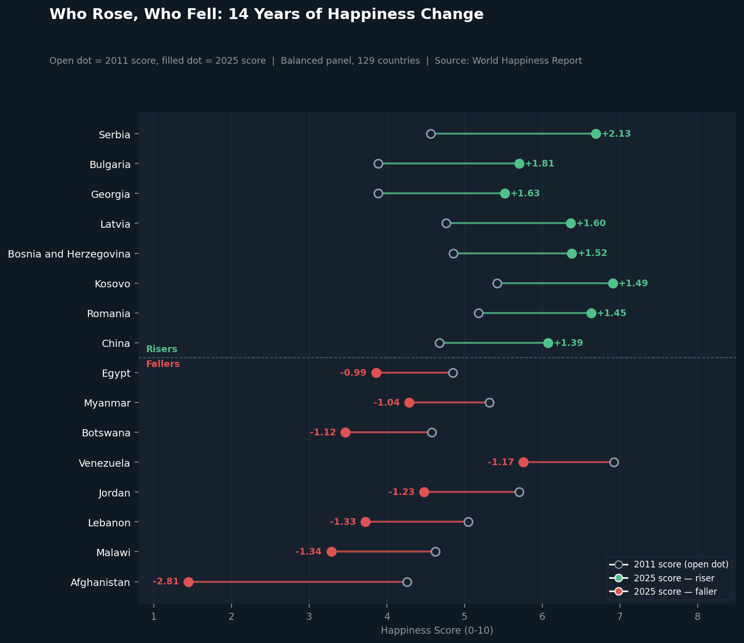 Scroll horizontally to inspect chart labels.Chart takeaway: Balanced panel of 129 countries from 2011 to 2025: the largest gains and losses show different paths
The largest top-to-bottom gaps were not about income alone
In 2025, the top 10 countries averaged 7.33 and the bottom 10 averaged 3.36. The average gaps were 0.83 points for GDP per person, 0.83 for social support, and 0.62 for healthy life expectancy.
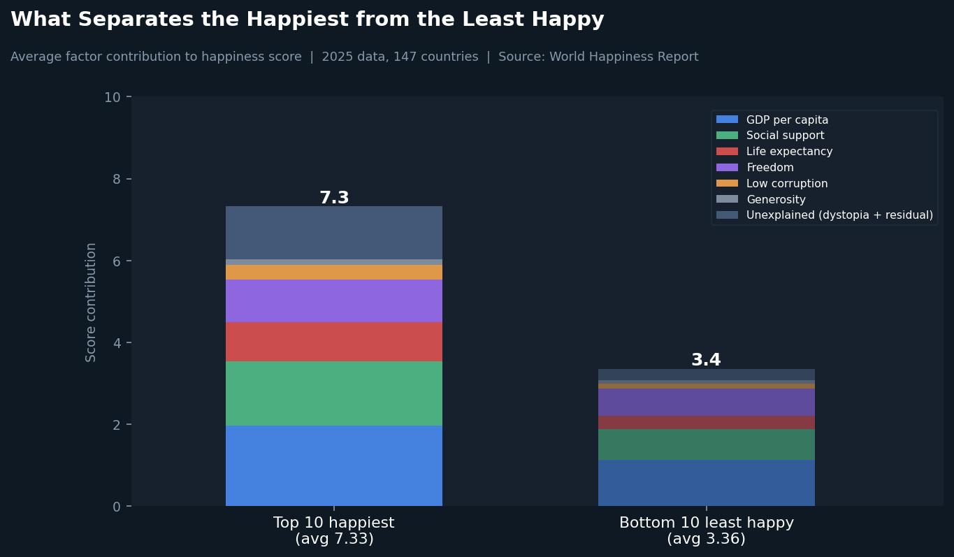 Scroll horizontally to inspect chart labels.Chart takeaway: Top 10 and bottom 10 countries in 2025: income, social support, and health had the largest component gaps
Social support, income, and health had the strongest associations
Across country-year observations from 2019 to 2025, correlations with life evaluation were 0.70 for social support, 0.68 for GDP per person, and 0.66 for healthy life expectancy. Generosity had a 0.04 correlation. The factors are related to one another, so these values do not isolate individual effects.
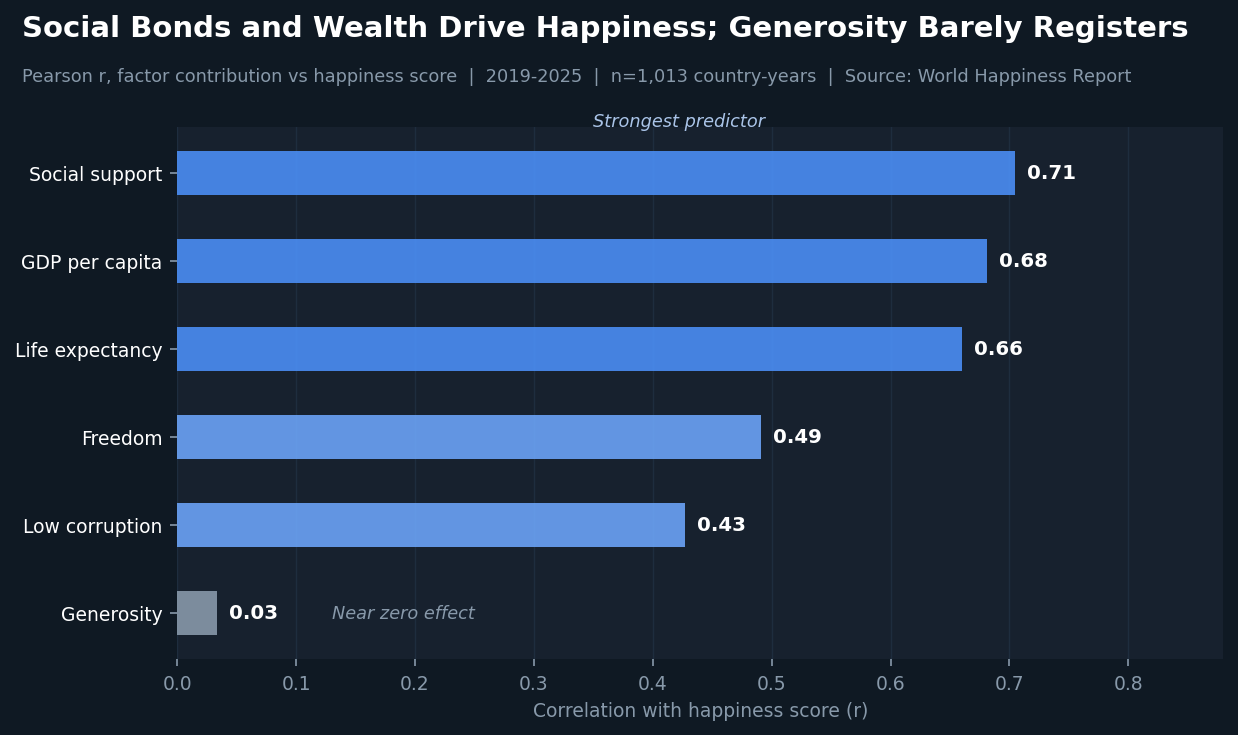 Scroll horizontally to inspect chart labels.Chart takeaway: Countries measured from 2019 to 2025: social support, income, and health had the strongest associations with life evaluation
The highest-to-lowest gap widened
The range grew from 4.8 points in 2011 to 6.3 points in 2025, an increase of about 31%. A wider range shows more dispersion; it does not tell whether the lowest-scoring group improved or declined without a separate group trend.
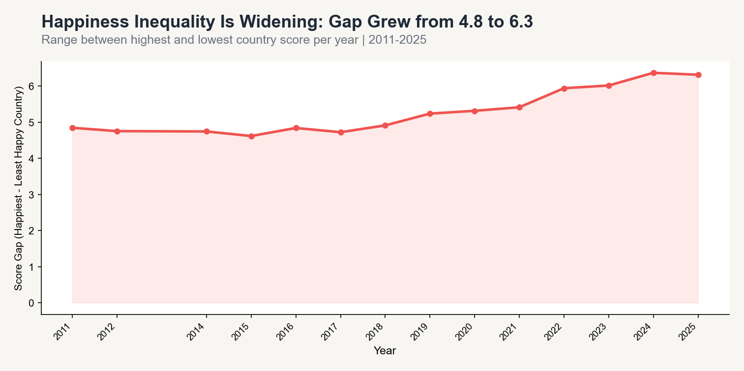 Scroll horizontally to inspect chart labels.Chart takeaway: Balanced panel of 129 countries from 2011 to 2025: the highest-to-lowest score range widened
Result - track average progress and distribution together
The fixed-panel average increased, and the score range widened. The evidence supports tracking both measures and monitoring the bottom of the distribution. It does not identify which policy caused a country's change.
- Track country trends over time alongside rankings.
- Review social support, income, and health as connected conditions, not independent causal levers.
- Focus follow-up research on countries and groups at the bottom of the distribution.
Public country data cannot show which programs changed living conditions or how outcomes differ within a country. A policy team would need local administrative outcomes, program reach, health access, household income, and survey microdata before choosing an intervention.
Technical notes
The analysis uses the World Happiness Report 2026 data for Figure 2.1. It checks source rows, country-year uniqueness, the 14 measured years, the 129-country balanced panel, and the reported averages, ranges, and factor correlations. The workbook is available from the official Data Sharing page. Code: World Happiness analysis scripts.