Marketplace Supply and Demand: What Can the Public Data Tell Us?
In brief
A limited-data marketplace diagnosis that separates recorded trips from the requests and driver hours needed to measure imbalance.
Business question
The Country Manager says riders are waiting longer and rides are being lost in some areas. The team wants to know whether to pay drivers more.
The first question is more basic: where is the marketplace under pressure, and what can the public data actually prove?
Why it matters
A low number of recorded trips can mean low demand or poor supply. A busy hour can still have many unserved riders. If the business gives incentives without knowing which problem it has, it may spend money without improving the customer experience.
Decision brief
- Recommendation: measure the request funnel first, then pilot incentives only in repeated shortage windows.
- Evidence: recorded trips peak at 18:00; reported 2025 trips rose while unique drivers stayed broadly flat.
- Potential value: not estimated; requests, contribution, and incentive cost are missing.
- Evidence strength: Medium for timing and activity signals; low for unmet demand or causal supply claims.
- Cost / resource requirement: Request, match, wait, online-driver, incentive, and contribution instrumentation is required; spend cannot be estimated from this dataset.
- Main risk: the hourly slice is from February 2019, while the monthly comparison is 2024–2025; spillover and cannibalization are unknown.
- Cost of inaction: Cannot be estimated from this dataset; a broad incentive could waste spend without improving fulfillment.
- Success / stop rule: Continue only if request fulfillment and contribution improve without shifting harm to nearby zones; stop if incentives only cannibalize supply or raise cost per incremental trip.
- Next action: add request, match, wait, online-driver, cancellation, incentive, and contribution fields.
My role
I owned the public-data analysis, proxy classification, limitation framing, and proposed zone-time pilot for this portfolio case. I did not operate an incentive program or observe platform fulfillment outcomes. I would hand the Country Manager a measurement specification and a randomized zone-time pilot design. SQL, Python, and source notes document the analysis.
Data used
I used two official TLC sources:
- A High Volume FHV trip table for 1–7 February 2019, with one submitted trip per row.
- TLC's monthly report for High Volume FHV activity, including reported trips per day, unique drivers, unique vehicles, and average hours.
The trip table contains 4,965,012 recorded rows. It shows activity that was submitted by licensed high-volume services. It does not show every request, rejected match, cancellation, true wait time, or driver who was online but did not receive a trip.
These sources cover different periods: the hourly slice is 1–7 February 2019, while the monthly report compares 2024 with 2025. They are complementary descriptions, not a single continuous time series, so the 2019 peak cannot be treated as the cause of the later monthly pattern.
Approach
- Find the hours with the most recorded trip activity.
- Compare activity with the number of drivers and vehicles reported by TLC.
- Separate direct observations from supply proxies.
- Decide what can be targeted now and what needs internal marketplace data.
- Design an incentive test that protects customers, drivers, and nearby zones.
Key findings
Recorded trip activity was highest in the early evening
The observed week had 59,285 recorded trips at 04:00 and 334,713 at 18:00.
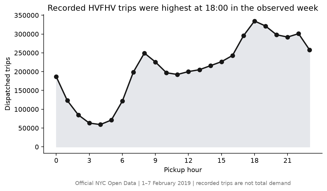 Chart takeaway: Official NYC HVFHV Open Data slice: recorded trips peaked at 18:00, but the public file does not show unserved requests
Business meaning: 18:00 is a sensible period for a supply investigation. It is not proof that riders were waiting longer or that the city needed more drivers.
More activity did not come with more reported drivers
TLC's monthly report gives a broader view. Average reported trips per day rose from 654,410 in 2024 to 667,537 in 2025. Average unique drivers stayed almost flat, from 83,399 to 83,299. Average hours per driver changed from 6.35 to 6.38 hours per day.
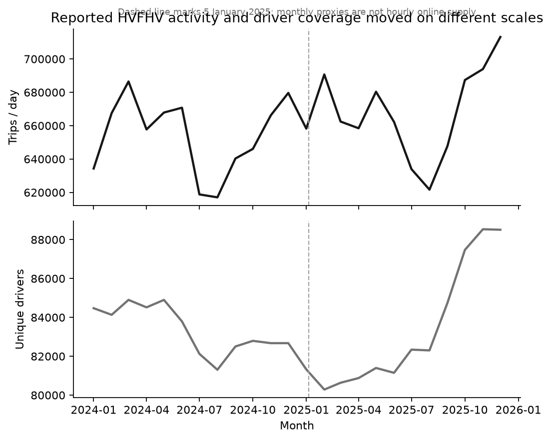 Chart takeaway: TLC monthly High Volume FHV reports: reported trips rose in 2025 while average unique drivers stayed broadly flat
Business meaning: the system recorded more activity without a comparable increase in reported driver coverage in the separate 2024–2025 monthly comparison. This is a useful pressure signal, but it is not an hourly supply count and cannot show whether the extra trips were profitable or fulfilled all demand.
The data supports a measurement plan, not a citywide subsidy
| Metric | What it means here | Status |
|---|---|---|
| Recorded trips | Trips submitted by licensed services | Directly observed |
| Unique drivers | Drivers appearing in a monthly report | Observed monthly proxy |
| Driver hours | Average reported hours per driver | Observed monthly proxy |
| Total requests | All people who tried to request a ride | Not available |
| Lost requests | Requests that were not matched or were abandoned | Not available |
| Zone-hour online supply | Drivers available in a specific place and hour | Not available |
Recommendation
What: Do not increase incentives across the whole city. First add request, match, cancellation, wait, online-driver, and incentive records.
Where / who: Use the 18:00 period as the first investigation window. Choose zones only after the request and wait data shows a repeated local problem.
Why: TLC shows a strong time pattern and broadly flat monthly driver coverage, but it does not show a true shortage.
Risk: An incentive may move drivers from a nearby zone instead of adding supply. It may also raise cost without improving fulfillment.
Next test: Randomize matched zone-time blocks between normal incentives and a targeted incentive. Use request fulfillment as the primary customer outcome. Track recorded trips per online driver-hour as a supply measure and incremental trips per incentive dollar as the economic measure. Include a washout period, border-zone monitoring, and a sample-size plan before launch.
What internal data would improve the decision
I would build a request funnel from request to match to pickup. I would add true driver online time, cancellations, estimated wait, passenger price, driver pay, incentive cost, contribution, spillover, and cannibalization measures. This would separate low demand, low supply, and poor matching instead of treating all three as the same problem.
Key takeaway
The public data shows when recorded marketplace activity is high and how reported driver coverage changes over time. It does not prove where riders are being lost. The responsible decision is to collect the missing request and availability measures, then test incentives only in confirmed shortage windows.
Technical appendix
The trip chart is generated from the official Open Data query. The monthly chart uses separate panels because trips per day and unique drivers are different measures. SQL, Python, source manifest, and validation document the analysis.