Congestion Pricing: A Comparator Audit Before Causal Claims
In brief
A descriptive audit of NYC bridge and tunnel traffic that shows why a plausible policy story is not enough for a causal business decision.
Problem - Did congestion pricing change traffic beyond its normal variation?
Congestion pricing began in New York on 5 January 2025. A mobility business may want to change rider pricing, driver incentives, or its city strategy in response. A simple before-and-after comparison cannot tell whether the policy caused a change or whether affected roads were already moving differently.
The decision is whether this comparison group is reliable enough to support a causal claim.
Hypotheses - What could explain a post-policy difference?
- The affected and comparison crossings may have different pre-policy trends. Compare their weekly gap before the policy date.
- A post-policy shift may come from another change. Weather, construction, holidays, commuting patterns, or facility disruptions can affect traffic.
- Crossing traffic may not track ride-hailing outcomes. Check what the MTA source measures before applying it to pricing or driver-supply decisions.
The first check can show whether this comparison is plausible. It cannot by itself establish why traffic moved.
Analysis - What does the MTA traffic panel show?
The source is the official MTA Bridges and Tunnels Hourly Crossings dataset. The checked panel contains 27,080 facility-day observations, grouped into 3,880 facility-week rows across 10 facilities, from 2019 through May 2026. Three affected crossings are compared with seven other facilities, with each facility weighted equally.
The comparison gap was already unstable before the policy
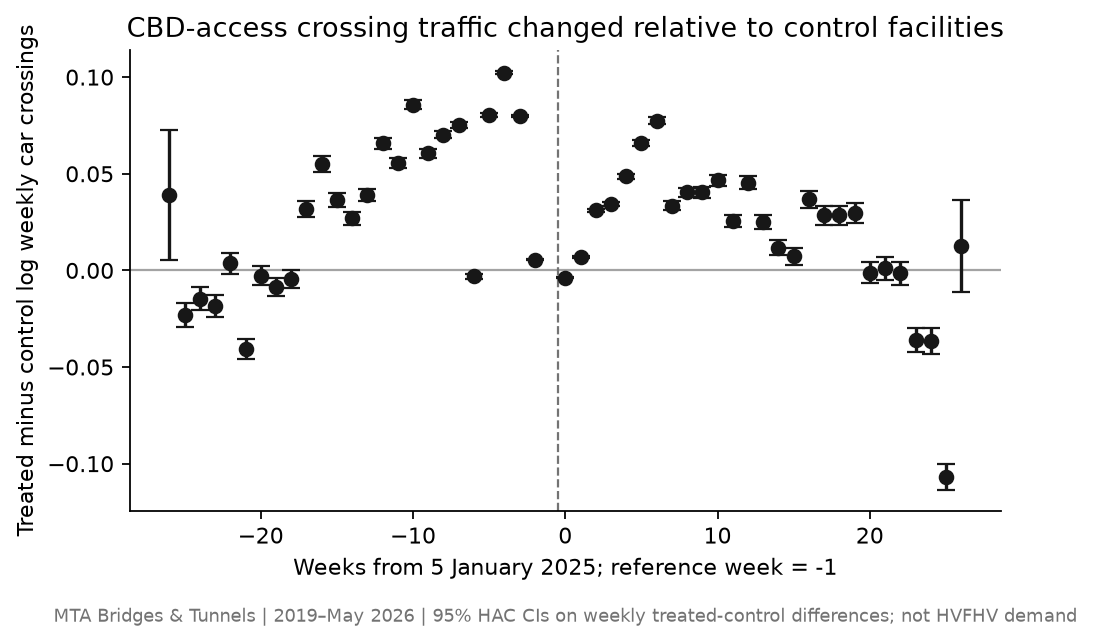 Scroll horizontally to inspect chart labels.Chart takeaway: MTA crossing audit: the affected-minus-comparison traffic gap moved in both directions before 5 January 2025, so this group is not a reliable causal baseline
The plotted weekly gap changes direction and size before the policy date. That is a visible warning about this comparison, not a formal statistical test. Each point is one weekly group difference, so no pointwise confidence interval or p-value is reported.
The panel supports a traffic audit, not a ride-hailing outcome
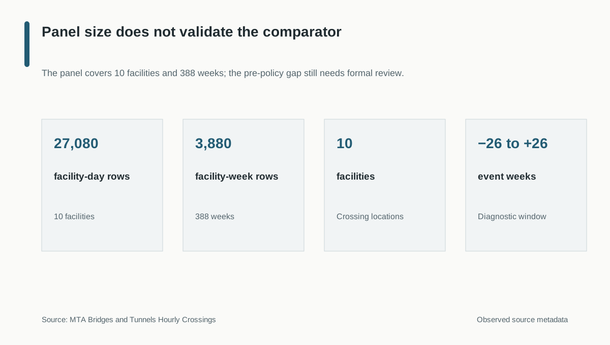 Scroll horizontally to inspect chart labels.Chart takeaway: MTA audit scope: 27,080 daily observations become 3,880 facility-week rows across 10 crossings, within a 26-week diagnostic window
The panel gives broad facility and time coverage for checking the comparison. A large panel does not make an unsuitable control group valid.
Important exposure and outcome data are missing
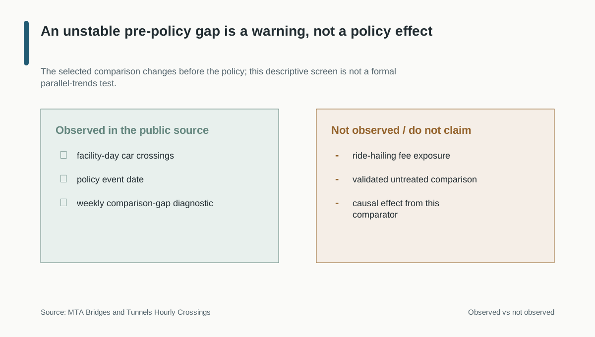 Scroll horizontally to inspect chart labels.Chart takeaway: MTA evidence boundary: facility-level car counts and the policy date are observed, but route-level toll exposure, ride-hailing requests, and a parallel counterfactual are not
The traffic records cannot show which trips incurred a fee or how riders, drivers, or platform economics changed. Those questions require route exposure and internal trip outcomes.
Result - Do not attribute the traffic difference to the policy
Measured result: the plotted affected-comparison gap varied before the policy, so this audit does not use the selected group to estimate a policy effect.
Not established: the diagnostic is descriptive. It does not formally reject parallel trends, estimate a causal effect, or measure ride-hailing demand, supply, revenue, or customer behavior.
Recommendation: do not change rider prices or driver incentives based on this comparison. First pre-register a comparator rule, test pre-policy fit and placebo dates, and account for weather, construction, transit, and facility disruptions. If the comparison passes, add route-level toll exposure and internal measures such as requests, rides, cancellations, pickup delay, passenger price, and driver pay.
Limitations: nearby crossings may be affected by spillovers, facility-specific shocks, or broader travel changes. The public MTA panel is useful traffic context, not a substitute for platform data.
Read technical details
Technical appendix
The outcome is the weekly facility-level log of one plus car crossings. The chart shows the treated-minus-comparison difference relative to event week −1 within a ±26-week window.
| Check | Evidence | Decision |
|---|---|---|
| Groups | 3 affected facilities and 7 comparison facilities | Keep as a descriptive audit |
| Panel | 3,880 facility-week rows across 388 weeks and 10 facilities | Reproducible weekly comparison |
| Pre-policy pattern | The weekly gap changes direction and magnitude | Do not use this group for causal attribution without further validation |
| Inference | One group difference per event week; no pointwise intervals or p-values | Avoid false precision |
| Outcome scope | All-car crossings, not ride-hailing requests, supply, trips, or revenue | Use as external context only |
The analysis code and validation notes document the weekly aggregation and decision boundary. Unexecuted future-design scaffolds in that folder are not evidence for this result.